
What does an orange air quality alert mean?
Orange means AQI 101–150, the band EPA calls Unhealthy for Sensitive Groups. Children, older adults and people with asthma or heart conditions should cut back on long or hard time outdoors; everyone else can carry on. The colour is EPA’s, and it is the same colour whichever agency put it in front of you — the wording around it varies, the band does not.
| Colour | AQI | EPA band | Who it is about |
|---|---|---|---|
| Green | 0–50 | Good | Nobody needs to change plans. |
| Yellow | 51–100 | Moderate | Unusually sensitive people may notice it; everyone else is unaffected. |
| Orange | 101–150 | Unhealthy for Sensitive Groups | Sensitive groups — including children, whether or not they have a condition. |
| Red | 151–200 | Unhealthy | Everyone, not just sensitive groups. This is where the warning widens. |
| Purple | 201–300 | Very Unhealthy | Everyone, at a more serious level. Not a new group — a stronger warning. |
| Maroon | 301+ | Hazardous | Everyone. Emergency-condition wording in EPA’s own scale. |
Orange means something before it means a number. So does the maroon almost nobody outside emergency management has seen. If a city page sent you here, you clicked a band name — Moderate, Unhealthy for Sensitive Groups. The number alone didn’t say what to do. This page is the AQI scale explained once, properly, so the city pages don’t each re-explain it.
EPA’s AQI runs 0 to 500 across six bands. Every air-quality site renders that table. What most skip: wildfire smoke and traffic exhaust land on the same number and feel roughly one band apart. “Sensitive groups” includes your kid without a diagnosis. And the index hit 938 in a Chicago suburb on July 16, 2026 — past where the chart is supposed to stop.
The Six Bands, Rendered Once
EPA assigns six bands across the 0–500 scale. AirNow, IQAir and EPA’s own site all publish the identical table below. Treat it as the one part of this page not in dispute.
| AQI range | Band | Color | Who EPA says to worry about |
|---|---|---|---|
| 0–50 | Good | Green | No one |
| 51–100 | Moderate | Yellow | An “unusually sensitive” few |
| 101–150 | Unhealthy for Sensitive Groups | Orange | Sensitive groups |
| 151–200 | Unhealthy | Red | Everyone |
| 201–300 | Very Unhealthy | Purple | Everyone, more seriously |
| 301–500 | Hazardous | Maroon | Everyone, emergency level |
Where the 121 metros we track sat on that table at the last reading, :
- Good — 92 metros, among them Bakersfield, CA (50), Albuquerque, NM (50), Long Beach, CA (50), Houston, TX (49)
- Moderate — 29 metros, among them Atlanta, GA (77), Nashville, TN (74), Riverside, CA (73), Fresno, CA (70)
The AQI scale explained in six words, in order: green yellow orange red purple maroon. The band table above answers most of the questions that route here. Yellow is Moderate. Orange is a code orange day, 101–150. Red — 151–200 — is code red, and it’s where “unhealthy for everyone” starts. Call the air “poor” and you mean one of those last three air quality categories, never green or yellow, whatever a hazy sky suggests.
The AQI calculation behind that number isn’t one reading. AirNow takes whichever tracked pollutant — PM2.5, PM10, ozone, carbon monoxide, sulfur dioxide, nitrogen dioxide — scores worst that hour. It checks that pollutant against its own breakpoint table, a PM2.5 breakpoint here, an ozone breakpoint there. Then it smooths the result with a NowCast average, weighting recent hours more heavily. That’s part of why a fast-moving event lags. How this project sources its own numbers lives on methodology.
Moderate Sounds Fine. It Isn’t — Here’s the Cigarette Math
AQI 54 sits mid-Moderate. A 24-hour dose at that number works out to roughly one cigarette’s worth of particulate exposure — a figure a 123-upvote r/AirQuality post published on July 12, 2026, not an EPA line, crediting a linked third-party calculator that doesn’t name its own ratio.
“Most people will think that anything under 150 is fine. But this is misleading,” they wrote. That names the failure every incumbent explainer on this SERP repeats: publishing “Moderate” with no caveat. One reply put it flatter: “There is nothing moderate about it… it is unhealthy for EVERYONE.”
That AQI-54 figure is the only cigarette-equivalent number this project can source. Scaling it up to AQI 100 — the number people actually search for — needs EPA’s exact PM2.5 breakpoints. This project hasn’t confirmed those. EPA revised that table in 2024, and this project hasn’t verified either version against the agency’s own publication. So no number is computed for AQI 100. The same shorthand gets pushed much further, with even less grounding, on an 832-upvote r/SeattleWA thread dated August 28, 2018. One commenter wrote: “At the time of the top pic, I was hearing the air quality was equivalent to smoking seven cigarettes per day.” That’s hearsay by their own wording, not a measurement, and it’s not tied to any AQI number at all. One reply pushed back: “What amount of time in the smoke outside was equal to smoking 7 cigarettes a day?” No answer to it appears in the thread’s top replies.
Is yellow air quality actually bad? EPA’s answer is no. Moderate spans a wide range, and most of it is fine for most people. The real complaint: the top of that range, AQI 90–100, gets filed under the same reassuring word as AQI 51. That’s the part worth distrusting, not the color.
Who “Sensitive Groups” Actually Includes
The phrase covers your kid by default, not only people with asthma or heart disease. EPA classifies children as a sensitive group with no underlying condition required.
Every top-5 competitor on this SERP uses the term without saying so. “Not realizing that children are considered a sensitive group even if they do not have an underlying health condition,” one parent wrote. Another, checking their own area’s guidance, confirmed the practical effect: “children is classified as sensitive group in my area. They supposed to stay inside if AQI reaches 100.”
Individual providers fill this gap. They don’t agree with each other. One Washington teacher and one Washington parent, both on r/toddlers in August 2025, report a cutoff around 75 at school and 80 at daycare. Both sit below the roughly-100 line most parents draw for themselves. One Minnesota parent, same thread, puts their child’s school right at that line: 100. One Wisconsin worker spent close to a decade in schools and daycares there. They don’t think the licensing rules mention air quality at all, only outdoor-time minimums, and suspect that gap is why a Wisconsin mother, posting on August 4, 2025, watched her daughter’s daycare keep every other child outside near AQI 150. Her own daughter stayed in only because she’d asked: “Am I crazy or are the laws just not keeping up with the times?” Nobody said she was. None of it is checked against state regulation text. It’s only what parents and staff report living under — the fuller version is on daycare air quality policy. This page defines the scale. That one tracks what providers do.
The Source Correction Nobody’s Band Table Makes
Wildfire smoke at AQI 50 and tailpipe exhaust at AQI 50 are not the same exposure. The community measures the gap at roughly one EPA band, not zero.
“Smoke at AQI 50 feels way worse than pollution at AQI 50. Different particulate composition maybe?” one asthmatic runner wrote on r/Asthma. Nobody in that thread had a lab result to confirm the mechanism, and neither do we. The theory offered in the thread, with a question mark on it, is different particulate composition. “Roughly one band worse” is the practical adjustment, not a settled finding.
Two more sources land on the same number and mean something different again. Phoenix’s haboobs put wind-lofted dust into the index — PM10, not PM2.5 — and it behaves nothing like smoke once inhaled. Denver’s own “brown cloud” is mostly vehicle and industrial nitrogen dioxide and black carbon, trapped by a thermal inversion. One r/Denver commenter, October 2025, quoted a fuller definition rather than write their own: “A layer of warm air traps cooler, denser air near the ground, preventing pollutants… from dissipating.” It checks out, as far as this project can confirm. Its original source is unstated. None of this counts pollen, which the AQI doesn’t track. A high-pollen day can read clean and still put someone in bed. The full national cause breakdown lives on why is the air quality bad today.
When the Number and Your Senses Disagree — In Both Directions
A 30 AQI reading and a visibly hazy sky aren’t a contradiction. Usually it’s smoke sitting aloft instead of at ground level — what one Seattle resident clocked in August 2026, asking “how is this 30 AQI?” “Smoke aloft mostly,” came the answer.
A second reply named a more mundane cause: station distance. “IQAir sensor seems to be sourcing from Auburn that was green, while eastside was already 100+.” Accurate for where it was measured, not where the reader stood. Government monitors update roughly hourly. Denser networks like PurpleAir refresh closer to every ten minutes and may sit nearer a given address — a second reason two apps disagree on the same backyard. The figure is also smoothed against recent hours by NowCast, so a sudden spike takes time to surface.
It runs the other way too. Ozone is the pollutant most likely to make a clear, odor-free day read as unhealthy. “Spreading awareness about ozone is tough because it’s mostly invisible and odorless,” one r/Denver commenter wrote. The Brooklyn parent who started that same June 2023 r/Mommit thread flagged the identical blind spot from the opposite side, in their original post: “it looks clear outside and doesn’t smell bad but I feel like all the harmful stuff is invisible.” Both are right. Ozone forms when sunlight hits exhaust and peaks on hot, clear afternoons — the kind of day that looks best for being outside. It carries no smell at all. None of this settles whether to go out or filter instead. That tradeoff is covered on indoor air quality.
The Scale Caps at 500. The Air Sometimes Doesn’t.
AirNow’s own scale stops at 500. Northbrook, Illinois read 938 on July 16, 2026 — not a typo, a number the official chart has no box for.
“The air quality index levels are absolutely absurd. The chart caps out at like 500 and the measurements are showing 700–800. Do NOT go outside unless you have to,” one Chicago-area resident wrote that day. Another posted the reading itself and linked its source: “938 in Northbrook right now,” with a direct link to IQAir’s station page for the area.
The 500 ceiling is very likely EPA’s own design choice, not a hardware limit. This project hasn’t sourced an EPA statement confirming it. Most likely: Hazardous tops out there because the agency treats anything past it as beyond the index’s useful range. It’s not a distinct emergency tier with its own numbers. That 938 reading is an IQAir figure, sourced straight to the commenter’s own link. Presumably it keeps running the underlying pollutant math past 500 instead of capping the display; this project hasn’t sourced that from IQAir either. AirNow’s number for the same air, same day, would most likely have simply reported 500 — AirNow’s chart has no box past that point. Treat anything over 500 as “worse than the worst official category,” not a precise reading.
Is 500 itself bad? Unambiguously. It’s the top of Hazardous, EPA’s most severe category, triggering emergency-level warnings for the entire population, not just sensitive groups. It also sits near the edge of what the official scale measures at all.
One Band, Four Different Verdicts
The same AQI 100 reading tells a runner to keep training, a parent to shorten the day, and at least one asthmatic to stay in. Three calls on one number, spread 1.8x between the loosest reader and the strictest.
A runner on r/Marathon_Training marked the loose end: “I’ll run in up to 110 because…error bars.” Another, answering a runner whose Chicago trip hit AQI 240, drew the opposite conclusion: “240 is untenable… I won’t run outside if it’s triple digits aqi.” Both are training logs, not EPA guidance. Present both — don’t average into a fake middle.
At the strict end, one asthmatic runner logged 156 runs and found their own cutoff at 60. “The official ‘moderate’ category is too broad to be useful for us,” they wrote. Their data backs it up: 87% of runs under AQI 50 went fine, 42% between 50 and 70, and 12% above 70. “My lungs struggle regardless of how well I’ve trained,” they added — though EPA classifies nothing below 100 as unhealthy for the general public.
Parents cluster near 100, but not uniformly. One parent on r/Mommit, June 2023, described a setting the six-band table has no room for. They read Brooklyn at about 60 and their own area at about 80, and let their daughter out “in short spurts today, like to water the garden or take the dog out to pee, but we’re not going to the park or running around.” Another commenter in that same 2023 thread named three settings by number: kids inside past 100, the family past 150, “when it’s over 200 we basically do a lockdown.” Duration and intensity are separate dials, not one switch.
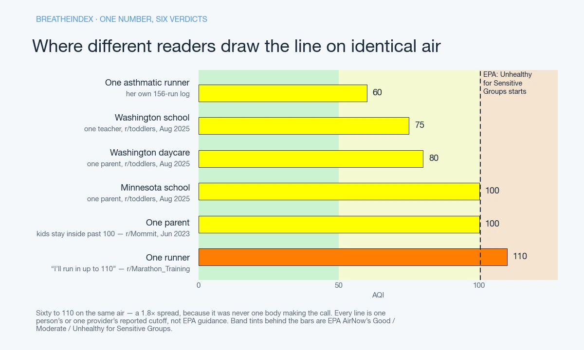
Provider-reported lines sit below all of them. What Washington families describe — roughly 75 at school, roughly 80 at daycare — undercuts the parental AQI-100 line; what one Minnesota parent describes matches it exactly; what one Wisconsin worker describes is no threshold at all, because as they read the licensing rules, those never raise the subject. Runner to asthmatic, that’s 60 to 110 — 1.8x on identical air, because it was never one body making the call. The number that matters is the one learned from a reader’s own log, the way the asthmatic runner above learned 60 from theirs — the AQI scale explained by the people actually breathing it, not by the chart alone.
Terms
Air Quality Index (AQI)
EPA’s 0–500 scale for how polluted the air is right now. It’s built from whichever tracked pollutant scores worst that hour, grouped into six color-coded bands.
PM2.5
Particulate matter 2.5 micrometers or smaller — small enough to reach deep into the lungs. The pollutant tied to symptoms like “my clothes smell like campfire.”
PM10
Coarser particulate matter up to 10 micrometers, mostly dust — what a haboob carries, distinct from wildfire smoke’s finer PM2.5.
Ground-level ozone
A gas formed when sunlight reacts with exhaust, peaking on hot, clear afternoons. Invisible and odorless, unlike smoke or dust.
Sensitive groups
EPA’s umbrella term for people at higher risk from a given AQI level — includes children by default, no diagnosis required.
EPA AQI breakpoints
The pollutant-concentration cutoffs, in micrograms per cubic meter, that map to each AQI band. AirNow publishes the full table and revises it periodically.
NowCast
AirNow’s weighted-average method for a displayed AQI, weighting recent hours more heavily. Part of why a sudden smoke event takes hours to fully register.
Thermal inversion
A layer of warm air atop cooler ground-level air, trapping pollutants that would otherwise disperse — the mechanism behind Denver’s brown cloud.
Smoke aloft
Wildfire smoke sitting high in the atmosphere rather than at ground level. It can make the sky look hazy while the ground-level AQI stays low.
Haboob
An Arabic-derived term for the wall-like dust storms common around Phoenix, carrying wind-lofted PM10, not combustion smoke.
Brown cloud
Denver’s name for its visible haze — vehicle and industrial nitrogen dioxide and black carbon, trapped by a thermal inversion.
HEPA filter
A filter rated to capture 99.97% of particles 0.3 microns in size — the standard behind most purifiers sold against wildfire smoke.
MERV rating
A 1–16 scale for how well an HVAC filter captures particles. MERV 13 is most recommended for PM2.5, though not every furnace handles the added resistance.
N95 / P100
NIOSH particulate-filtration ratings: N95 blocks 95% of particles at the hardest-to-filter size, P100 blocks 99.97%. Either needs a tight facial seal to filter as rated.
Code orange / Code red
Everyday shorthand for Unhealthy for Sensitive Groups (orange, 101–150) and Unhealthy (red, 151–200). Not an EPA term — but what local news and school alerts actually say.
AQI colour bands
The six-color system — green, yellow, orange, red, purple, maroon — that EPA assigns to its six AQI ranges. Color signals risk before anyone reads the number.
The six bands, and what each one means
| 0–50 Good | Nobody needs to change plans. | |
|---|---|---|
| 51–100 Moderate | Fine for most. A few unusually sensitive people notice it. | |
| 101–150 Unhealthy for Sensitive Groups | EPA singles out sensitive groups here — asthma, heart or lung conditions, older adults, children. | |
| 151–200 Unhealthy | This is where the wording stops singling anyone out and starts saying everyone. | |
| 201–300 Very Unhealthy | The same everyone-warning, more serious. Not a new group being swept in. | |
| 301+ Hazardous | Emergency conditions. The scale is designed to run to 500, and readings above it have happened. |
The cigarette comparison
AQI 54 ≈ 1 cigarette a day
Questions people ask
What AQI should you stay inside?
No single number. EPA names 101–150 for "sensitive groups," which includes healthy kids by default. Individually reported cutoffs run tighter: about 75–80 from one Washington teacher and one Washington parent on r/toddlers, 100 from a Minnesota parent, none at all from a former Wisconsin daycare worker — none checked against state regulation text. Match the number to who's actually going outside.
How many cigarettes is 100 AQI equal to?
The only grounded figure is AQI 54, not AQI 100 — an r/AirQuality post put a 24-hour dose there at roughly one cigarette's worth of particulate exposure, via a linked third-party calculator that doesn't name its own ratio. Scaling that to AQI 100 needs EPA PM2.5 breakpoints this project hasn't confirmed, so no number is computed for it here.
What is the safest Air Quality Index?
EPA's Good band, AQI 0–50 (green), poses little or no health risk to anyone, sensitive groups included — the only band with no "who should worry" qualifier in the agency's own guidance.
Is a 500 air quality bad?
Yes. It's the top of EPA's Hazardous category, its most severe tier, triggering emergency-level warnings for the entire population, not just sensitive groups — near the edge of what the scale measures at all. Northbrook, Illinois read 938 on July 16, 2026, well past where AirNow's own chart stops.