
Air Quality by City: 69 US Metros, Grouped by Airshed
Live AQI for every US metro with a page of its own, grouped by the airshed that shapes its air — plus the metros we measure hourly without one, and why.
Nothing here matches . We cover the metros with their own page and every state where we track two or more — a city we don't list is one we can't source a reading for, not one with clean air.
| UT Salt Lake City | 44 | |
| CA Los Angeles | 60 | |
| NY New York | 24 | |
| IL Chicago | 30 | |
| TX Houston | 49 | |
| CO Denver | 44 | |
| GA Atlanta | 77 | |
| AZ Phoenix | 66 | |
| WA Seattle | 37 | |
| MN Minneapolis | 23 | |
| CA Bakersfield | 50 | |
| WA Spokane | 34 | |
| CA Sacramento | 38 | |
| CA Fresno | 70 | |
| PA Pittsburgh | 41 | |
| OR Eugene | 28 | |
| ID Boise | 32 | |
| CO Fort Collins | 38 | |
| NV Reno | 43 | |
| NM Albuquerque | 50 | |
| WI Madison | 31 | |
| AZ Tucson | 44 | |
| CO Colorado Springs | 42 | |
| MO St. Louis | 44 | |
| CA Irvine | 46 | |
| CA Oakland | 48 | |
| CA Long Beach | 50 | |
| WI Milwaukee | 38 | |
| OR Portland | 26 | |
| MO Kansas City | 53 | |
| FL Miami | 59 | |
| FL Tampa | 47 | |
| HI Honolulu | 13 | |
| IN Indianapolis | 35 | |
| IA Des Moines | 53 |
| KY Louisville | 44 | |
| LA New Orleans | 40 | |
| MD Baltimore | 37 | |
| MA Boston | 24 | |
| MI Detroit | 40 | |
| MT Missoula | 21 | |
| NE Omaha | 36 | |
| NC Charlotte | 52 | |
| NC Raleigh | 53 | |
| OH Columbus | 34 | |
| OH Cleveland | 37 | |
| OK Oklahoma City | 41 | |
| OK Tulsa | 43 | |
| SC Columbia | 54 | |
| TN Nashville | 74 | |
| TN Memphis | 52 | |
| NV Las Vegas | 51 | |
| PA Philadelphia | 36 | |
| TX Dallas | 42 | |
| TX Austin | 52 | |
| TX San Antonio | 52 | |
| DC Washington | 42 | |
| CA San Diego | 61 | |
| CA San Jose | 51 | |
| CA Riverside | 73 | |
| OH Cincinnati | 37 | |
| CO Boulder | 44 | |
| CA Anaheim | 46 | |
| FL Orlando | 34 | |
| TX Fort Worth | 42 | |
| FL Jacksonville | 57 | |
| AZ Scottsdale | 37 | |
| MN St. Paul | 23 | |
| CA Stockton | 51 |
Browse by state
This index covers 69 US metros grouped by state, then by the airshed driving their air. A guide is written only once a metro’s typical month clears 500 searches; a data page ships above 200. Search demand tracks smoke and inversion exposure, not population: Boise out-searches Phoenix, the fifth-largest US city. Its 12-month average runs 12,100 a month against Phoenix’s 9,300, despite Boise being a fraction of Phoenix’s size. Wenatchee, WA (population ~35,000) pulls more than double Atlanta’s volume, for the same reason — proof this page should sort air quality by city, not by population rank.
Cities, grouped by state and airshed
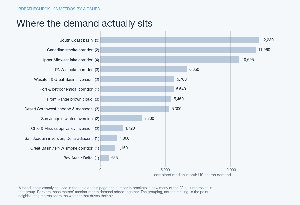
Find your state, then your city. The airshed column names the mechanism — inversion, lake corridor, drifting smoke. Two cities in the same state can sit in different ones. California alone splits three ways.
| State | Metro | Airshed / mechanism | Median month | Right now |
|---|---|---|---|---|
| Arizona | Phoenix | Desert Southwest haboob/monsoon | 3,780 | |
| Tucson | Desert Southwest haboob/monsoon | 720 | ||
| California | Los Angeles | South Coast basin | 10,900 | |
| Long Beach | South Coast basin | 610 | ||
| Irvine | South Coast basin | 720 | ||
| Fresno | San Joaquin winter inversion | 1,300 | ||
| Bakersfield | San Joaquin winter inversion | 1,900 | ||
| Sacramento | San Joaquin inversion, Delta-adjacent | 1,300 | ||
| Oakland | Bay Area/Delta | 655 | ||
| Colorado | Denver | Front Range brown cloud | 3,930 | |
| Colorado Springs | Front Range brown cloud | 720 | ||
| Fort Collins | Front Range brown cloud | 810 | ||
| Georgia | Atlanta | Canadian smoke corridor | 3,860 | |
| Idaho | Boise | Great Basin / PNW smoke corridor | 1,150 | |
| Illinois | Chicago | Upper Midwest lake corridor | 6,520 | |
| Minnesota | Minneapolis | Upper Midwest lake corridor | 2,920 | |
| Missouri | St. Louis | Ohio & Mississippi valley inversion | 720 | |
| Nevada | Reno | Wasatch & Great Basin inversion | 800 | |
| New Mexico | Albuquerque | Desert Southwest haboob/monsoon | 800 | |
| New York | New York | Canadian smoke corridor | 8,100 | |
| Oregon | Eugene | PNW smoke corridor | 1,450 | |
| Pennsylvania | Pittsburgh | Ohio & Mississippi valley inversion | 1,000 | |
| Texas | Houston | Port & petrochemical corridor | 5,640 | |
| Utah | Salt Lake City | Wasatch & Great Basin inversion | 4,900 | |
| Washington | Seattle | PNW smoke corridor | 3,300 | |
| Spokane | PNW smoke corridor | 1,900 | ||
| Wisconsin | Madison | Upper Midwest lake corridor | 720 | |
| Milwaukee | Upper Midwest lake corridor | 535 |
“Median month” is the typical month, not the smoke-inflated 12-month average. “Right now” pulls each metro’s live, hourly AQI reading: the air quality index color band. It follows the EPA AQI breakpoints explained on the AQI decoder. That includes where “Unhealthy for Sensitive Groups” starts. No reading beats a stale one.
Every built city page also carries a modelled UV reading, and names the AirNow reporting area behind its number with how far it sits from the metro centre. Set an air quality alert on any of them for the next spike.
Why these metros, and why the count changed
BreatheCheck’s original bar was a hand-written guide: a metro earned one only when its typical month cleared 500 searches, because a guide costs weeks of reading community reports and agency documents to say anything specific. Twenty-eight metros cleared it.
That bar still stands for guides. What changed is that a second kind of page now exists. A page built from our own measurements — the reading, the verdict, the station behind it, our own history — costs a fraction of a guide, so it clears a lower bar: a median month above 200 searches. Sixty-nine metros meet that, and the ones without a guide say so on the page rather than reading as though one exists.
The distinction is worth stating plainly because it decides what you get. On a metro with a guide you also get what actually drives its air — the inversion, the fire corridor, the port — researched rather than inferred. On the rest you get the numbers, honestly labelled, and nothing written to fill the space.
We still measure far more than we publish: 121 metros feed the pipeline. The ones with no page of their own appear on the map and in the state roll-ups with a live reading and no link, because they do not clear that 200-search floor. Their readings are recorded all the same, so the history is already there if one ever does.
Most of these are quiet eleven months a year
Most of the metros in this index are quiet eleven months a year. Milwaukee’s 12-month average of 8,100 runs 15.1x its typical month; Spokane’s runs 14.3x, and Madison’s runs 13.8x. Cleveland’s 25.2x is the extreme case among cities reviewed — a metro whose apparent volume is almost entirely one smoke event.
Pittsburgh shows the same shape at 12.1x. Salt Lake City needs just 1.7x, the smallest overstatement here. Oakland breaks the pattern outright — its median month (655) beats its own average (590), the only metro here where that’s true, driven by port and freeway traffic rather than one flood a year.
Arrive on a quiet month and a city page can look overbuilt. Arrive during its event, and it’s the only source here with a shape to compare against.
Updated
This page has been corrected, most recently on — the city index still said Kansas City had no page, in its opening line and its structured data. See the correction log.